Thursday, September 21, 2006

When I started working on this image (this is the first color sketch) I thought it was so right and was hugely happy. The whole thing just seemed to glow, it hung, as I like to say.

After a month of hard slog in which I abandoned it countless times I eventually settled on something entirely different.

So, whats the point?

I think its that as an artist you have to keep an open mind, it is the journey that leads to the destination and without one the other is meaningless. Without an open mind we force ourselves to repeat mistakes and follow useless leads and directions.

Without an open mind we would always be stuck in one place that didn't allow for change or growth. It may be a place that we like to be, but even the things we like to be must be discarded eventually if we are to go forward.

And the point? Well, thats usually the sharp bit at the end...
This you have to see. Its a one third working model of a Ferrari 312PB. (1973 Group5 S3000 Endurance car.)

Obsessive doesn't even begin to cover the guy who put this together, he even learned to blow glass to model the headlights.

The car is profiled on Jalopnik as well as having a gallery dedicated to it at Fine Art Models.

Wednesday, September 20, 2006

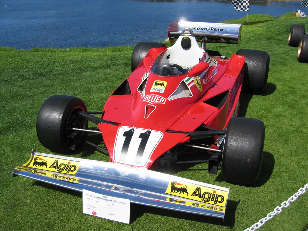
1977 Ferrari 312-T2

This is one of my favorite cars from the 70's. Its beautiful in a strange over-nostriled kind of way.

The image is from the excellent atspeedimages.com. I recommend that you take a look at the gallery over there. They also have a 1976 version a little higher in the gallery list which would have been exactly like the one driven by Lauda in his dreadful crash at the Nurburgring during the 76 season.
Whats the point of having a blog if you can't update the damn thing. Blogger acting up again.

Jesus H. Priest.

I'll be working on a birthday card for my girl, if I can upload some stuff later I will.

Tuesday, September 19, 2006

I'm going to be busy today so I thought I'd post and oldie from a book project. Its a combination of Illustrator and Photoshop using a lot of levels.

The type is set up to print in silver (Pan 877) on the left hand side. I spent a lot of time sailing when I was a kid and I love boats, (but not as much as cars.)

The process for this piece was fairly straightforward. The image was mostly done in black and white and then I used adjustment layers to add the color, mostly overlays in fact.

The numbers were created individually and then added to layers above before using motion and gausian blurs to blend them into the image. All the rigging on the boat was added in Illustrator and then imported as a 'smart objects' layer before flattening and blurring/blending to give it a more painted look.

Anyways, I'm really happy with this one even though it took a long time to get it right. This is probably the fifth or sixth version of the image, earlier versions being black and white, chalk and charcoal and pen and ink.

Monday, September 18, 2006


New revised model posed and printed with a few scribbles to define some shapes and decals on it. Can't seem to get blogger to post much of anything today.
Can't seem to post shit to blogger today.

Sunday, September 17, 2006

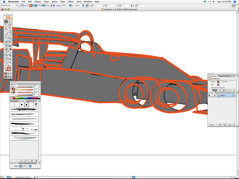
So using a render of the revised model I start the tracing in Illustrator. I'll print this out to start marking in the decals and details.

If you look at the real T34 theres a small window just in front and below the mirrors so that the driver could see 'those little shopping cart wheels locking up going into a corner' as Scheckter said of them. He apparently didn't like the car.

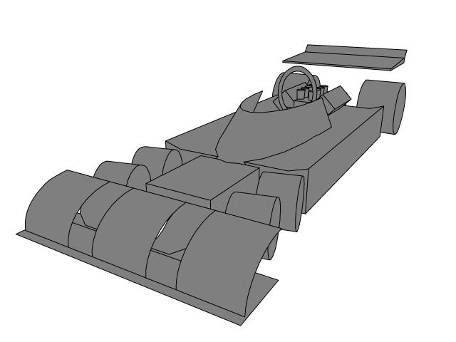
This is the revised model. The proportions of the T34 are much more complex than the F1 cars of the sixties with their cigar shaped bodies. I think that part of the problem is that you're not used to seeing a car with six wheels and so the shape of the front end can be confusing because you're just not used to seeing something so odd. I simplified the body at the back of the car and increased the size of the radiator as well as lenghtening the cockpit area so that it starts slightly before the front set of wheels. I also reduced the size of the aerodynamic flip-ups that sit in front of the rear tyres. My model is based more on the 1976 version of the T34 as opposed to the more shrouded look of the 1977 version which has a one piece canopy that sits over the frame and roll bar/crash structure behind the driver.

Aero was becoming more and more important in grand prix car design in this period.

Saturday, September 16, 2006

I had to go back and edit the model somewhat, removing some of the bodywork at the back where the radiator is and lengthening the cockpit area, reprofiling the front edge of the canopy etc.

Its a lot harder to make a model when you have limited reference but I don't want an exact copy, just the flavor.
Quick sketch to try to pin down the decoration and details.


Working on the T34, leaving out a lot of detail stuff for now so I can concentrate on form and color. Same method that I used for the Lotus 25 and Auto Union D Type in the H666 project except that this is for a t-shirt design so I'm using a full 4 color process instead of spots.
Where does it go from here? I would direct you to this earlier post to show the process of turning a rougn model into a final illustration.

Friday, September 15, 2006


So this is pretty much all I need from the T34 model. The top image is the 'finished' model and the two bottom images have had a distortion lattice applied. Easy no?
PROJECT DANTE

I just finished rewriting Canto I and then I had a sudden realization. Dante is as dull as dishwater. Whats more, its very hard to understand because of the huge number of cultural and specific reference and metaphor that laces the poem. I think that even with my abridgement that the book would be too long. I need to start again and reduce each Canto to a verse of 8-16 lines. I'm looking for the spirit of the poem without boring my own tits off. After all, the only reason that I'm doing this is so I can do some cool illustrations. I have to make sure that I'm not setting myself up for years of work on something that has nearly zero chance of any return. So, for my own sake, it has to be fun (and fast wouldn't hurt either.)

If I left the Canto's at the length they are then the book would require about one hundred page spreads. Thats one hundred illustrations. Hmmm. I was rather hoping for closer to half that or less.

Anyway, tonight I intend to cut the rubbish and distill the piece instead of just rewriting it. So its back to the drawing board for me.

Thursday, September 14, 2006


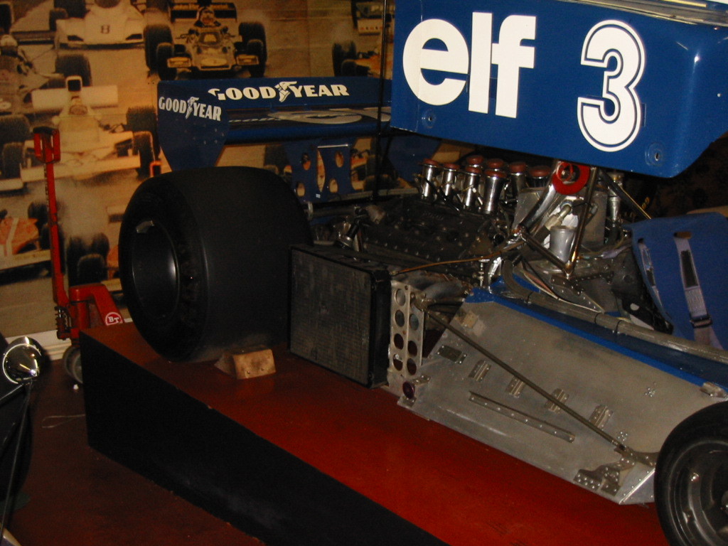
Just looking at these pictures of the T34 I'm noticing a couple of things, the position of the radiators for a start. On a modern F1 car the radiators are force fed through the side pods of the chassis. You can see above where these radiators just lie flush with the bodywork running parralel to the NS axis of the engine. It seems like an odd thing to do as the cars forward motion wouldn't seem to have much effect on the amount of air being fed through to cool the engine.
Adding more details to the chassis, mostly the little aero flicks and mirrors etc. The thing about these cars from the seventies is that more and more of the engineering details are hidden below the increasingly fluid bodywork. This is still before the age of carbon fiber so the bodies were constructed of aluminium and honeycomb sandwich composites.
Better view with the engine in place.
work continues on the T34 model. The shapes are very basic, everything will be overdrawn anyway so this is just for placement.

I think I've mentioned before that I can't draw solid shapes for toffee...


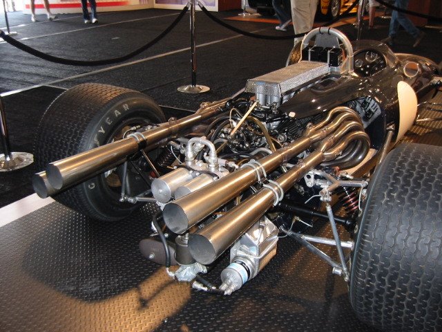
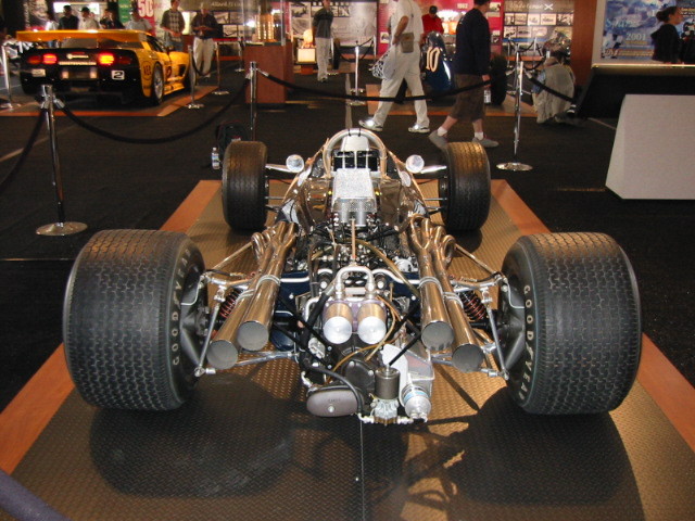
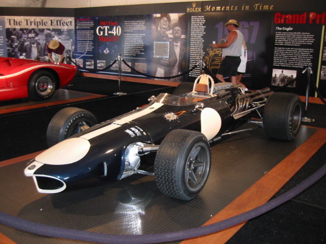
A 1967 American Eagle Gurney F1 car. Isn't it fantastic. Look at the detail and engineering. The thing I love about the cars of the sixties is that this is what formula cars looked like before the downforce era that was to soon follow. Modern Formula 1 cars look like they've been grown but these cars from the sixties were built. Maybe not well built by todays standards but these things were made out of steel and aluminium, carbon fiber was not a part of racing car construction then.

Theres a 1/8 model of this car for sale in Autobooks in Burbank on Magnolia going for about 1400US$ which if anyone would like to buy for me I'd be more than happy.

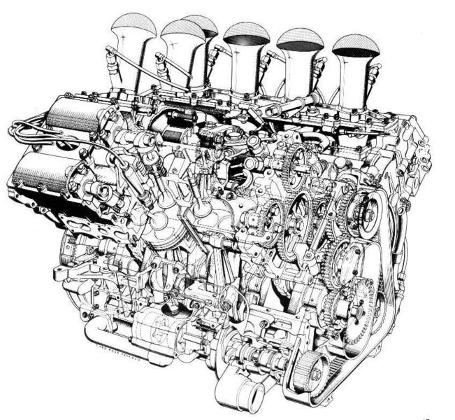
Just have to post a link to this site. I was looking for reference on the Cosworth Ford DFV and I found a site called atspeedimages.com

Incredible design no? It was designed by a guy called Derek Gardner.
Just started working on some more cars, I want to do some designs for T-shirts and I'm thinking about another story using some of the most iconic cars from Formula 1 history.

This is going to be the Tyrrell T34 from the mid seventies. I love this car even though its racing pedigree is less than stellar. Its very much in the spirit of Formula 1 that a designer would examine the rules and come to the conclusion that nowhere was it written that a car had to have only four wheels. Anyway, this is the basic model in the process of building and theres still a lot to do. I haven't touched the back of the car yet, the wings etc. The engine was a Cosworth Ford DFV.

Wednesday, September 13, 2006

Just got my copy of "the CAT on a hot thin groove" and it is brilliant.
PROJECT DANTE

I'm still working away on Canto I. I think I may finish it tonight. This may be heretical to say, but the only reason why I have to rewrite the Inferno is because its so f@*king boring.
Beautiful footage of a Ferrari V12 being assembled.

Now I hate Ferrari F1, but this is something else and I have to say that the process of casting the aluminium block at the start of the video is absolutely incredible.

Tuesday, September 12, 2006

http://www.selfpublishingblog.com/

Lots of information about printing and self publishing.

PROJECT DANTE

This is how I'm starting with the Dante work, sketching on my copy of the book and making notes on the test flow to figure out where the important parts are.

I'm about two thirds of the way through the first Canto, hope to finish that up tonight and move on to Canto II. Just to give you an idea of how big this project is, there are 34 canto's in the Inferno, so its a lot of work and may take a long time.

Stay tuned.
APPLE SPECIAL EVENT STARTING IN 3..2...1.....
Scrummy. I think I'm getting moist...

Monday, September 11, 2006

Well said that man...

And then, in perhaps his finest piece of writing, Rod Serling sums it up with words of remarkable prescience, given where we find ourselves tonight: "The tools of conquest do not necessarily come with bombs and explosions and fallout. There are weapons that are simply thoughts, attitudes, prejudices, to be found only in the minds of men.

"For the record, prejudices can kill and suspicion can destroy, and a thoughtless, frightened search for a scapegoat has a fallout all its own -- for the children, and the children yet unborn.

Here I'm laying in the highway artwork in the same template by replacing the dog artwork. I'll resave the file changing the project name and then export a pdf ready for print tomorrow.

I'm completely pooped. I spent the day lifting boxes and moving them out of storage for a big job due on thursday. I think I'll have a couple of games of poker, a beer and then a little nap before dinner.
Laying out the cd insert cards. I leave a gap between them so when I cut one I don't destroy another. Because the final dimension for these is 5x7" I can lay them out 4up on a 12x18" sheet.

I'll use the same template to drop in the other layouts for the dog and the highway projects at the same time.

Easy eh?
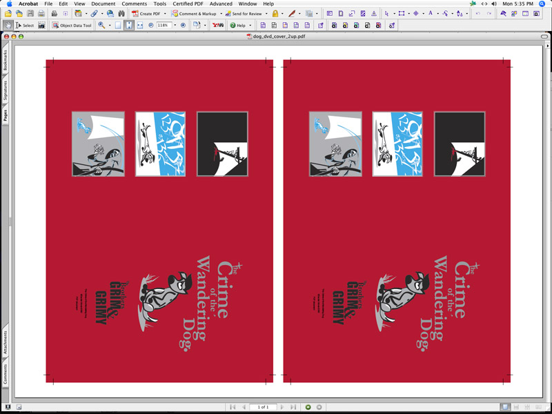
All the cd labels exported as pdf's with the templates removed, ready for print.


Getting ready for a mammoth printing session tomorrow by laying out all my files in multiples on my final sheet size. The printer I use is a Xerox D250 Color Center with a Fiery front end and handles sheets up to 13x19 inchs although I generally run no bigger than 12x18.

I'll hand cut the final pieces after they're printed because its easier and faster for cutting a couple of things than setting up a hydraulic cutter. Each of the files was exported as a pdf from Indesign and then placed on a sheet 2 up. Because I keep these templates around I can just replace one file with another very quickly and batch produce the 'for print' files in a matter of minutes.
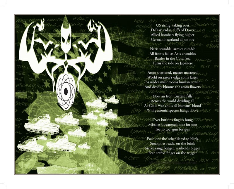
So this is the revised spread from 'The Crime of the Wandering Dog' suing the Atomic Spectre that I had designed a couple of weeks ago.

This is a pure Photoshop piece using a lot of blending layers and multiple elements and adjustment layers as well. The Indesign spread has 4 elements, the imported and placed photoshop piece, the double stroked outline, the test layer on the right and finally the Illustrator atomic element in the middle of the spectre's stomach.
PROJECT DANTE

Blogger is slow again this morning.

I have a lot of work to do today, there are two large jobs that are due on Thursday and Friday which will take most of my time this week to make the deadlines.

I started rewriting Dante's Inferno on saturday while I waited for my girlfriend at the dentist. Its going well so far although I've only just begun on Canto I (32 or so to go.)

I've wanted to do illustrations for the Inferno for a long time, but I came to the realization that the poem itself is largely inaccesable because of its complexity. So I'm going to change it. Heresy I know, but besides its lenght it doesn't work as a 'poem' in english. So my number one task is to make it work in the vernacular and to abridge it to a lenght that I can work with.

The actuall writing part of this is not something I'm looking forward to but it'll need to be done if I want to do the illustrations I have planned. And I do want to do these illustrations.

I think this one may take a while. Luckily I've set myself no time limit on it because I'm sure that no one is interested in it besides myself.

PS I won't be touching either the Purgatorio or the Paradiso, I just have no real interest in going near these parts of the Comedy.

Sunday, September 10, 2006

Fuck you Scummy, fuck you.

PS If the FIA has such a hard on for this prick and his team they should just give him the championship now and stop with the changing of the rules and penalties for Alonso and Renault.

PS I was going to post the footage of Scummy celebrating his win at San Marino while they intercut with footage of Senna's blood being mopped up but I think I'll save it.

Laugh it up Scummy, laugh it up.

Saturday, September 09, 2006

I'm working away from the computer today so I just thought I'd post a quick list of the books I'm reading now. When I'm looking for a new project I start to read anything and everything I can get my hands on until something starts to click.

So in no particular order heres what I have open right now.

Doyle Brunson's Super System
Dante's The Divine Comedy translated by Allen Mandelbaum
The Animator's Survival Kit by Richard Williams
Cartoon Modern by Amid Amidi
The Demolished Man by Alfred Bester
Speed Addicts by Mark Hughs
Raw Spirit by Iain Banks
Equal Rites by Terry Pratchett

There are some other books on my list as well but as I've not opened them yet I can't claim to be technically reading them yet. This is all part of the process for hunting out some ideas for where I want to go next.
Just finished watching qualifying for Monza, I'm fairly fuming. Doesn't matter what the stewards do, Scummy can't win the championship here no matter what happens and theres no Italian stewards anywhere near the last three races.

So fuck you scummy, ferrari and monza. Lets see what happens tomorrow.

Oh yeah, nice one Kimi.

Friday, September 08, 2006

This is a test, blogger is crapping out on me big time...
Check out the Casino Royale trailer.

Its got everything, fast women, poker, scarred pyschopaths and Aston Martins.
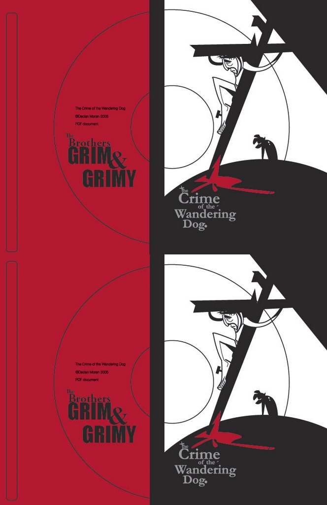
This is the label for the dog dvd. I used the same colors as for the insert and dvd cover and left the template visible to show you where the peel lines are.
And there it is, simple.

I had tried using a repeat pattern using dog illustrations and some other elements from the book but it was too complicated and it didn't really seem to suit the style of the project.

I'll do a test print of this to make sure it works.

The insert cards will be printed on a 12pt C2S (thats a 12 point coated 2 sides card stock) and trimmed to 5x7".

The way this would be abreviated when speccing a job like this would be 5"x7" (size) 4/4 (color, in this case CMYK) on a 12pt C2S. Easy eh?

5"x7"4/4 12pt C2S. The inverted comas (") are used to spec either feet or inches but for most work its assumed that inches are implied.
So I created a simple repeat pattern using the dog logo and I'm in the process of exporting a pdf to see how it hangs.
I'm working on the last dvd insert card. Its for 'The Crime of the Wandering Dog' and I have the front already done, just need to work on the back. Something with spots or dogs or crosses perhaps. I need to play around with it for a while to work something out.

PS Don't forget that its a GP weekend.

Thursday, September 07, 2006

Not quite a bluff...
Here the standard 'Brothers' logo and portrait for the front on the card using the projects accent color.
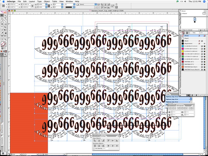
And there it is, a handy little repeat pattern that I can throw down anywhere. In this case its for the back of the dvd insert card but it could go anywhere.
Once I have a large field of logo's laid out I grouped the lot and rotated it by 45degrees to splash it nicely across the cards back.
I started laying out a repeat pattern using the highway logo for the dvd insert. The front of the insert uses a standard 'Brothers Grim & Grimy' front with the logo and portrait on the accent color field.

I started here by arranging 2 logos top to bottom and then grouping, copying and pasting to build up the pattern.