I'm working away from the computer today so I just thought I'd post a quick list of the books I'm reading now. When I'm looking for a new project I start to read anything and everything I can get my hands on until something starts to click.
So in no particular order heres what I have open right now.
Doyle Brunson's Super System
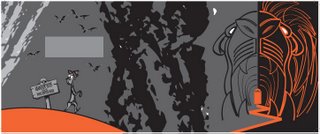
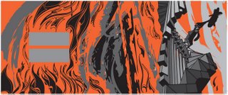
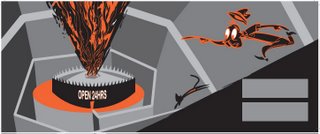
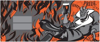
Dante's The Divine Comedy translated by Allen Mandelbaum
The Animator's Survival Kit by Richard Williams
Cartoon Modern by Amid Amidi
The Demolished Man by Alfred Bester
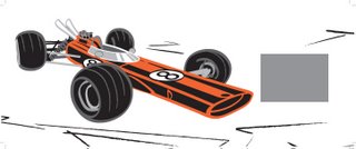
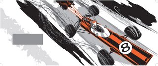
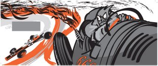
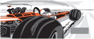
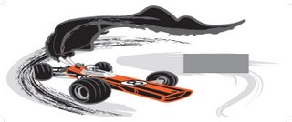
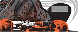
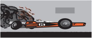
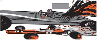
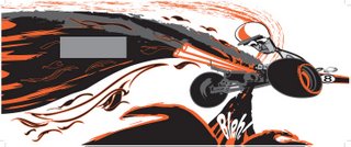
Speed Addicts by Mark Hughs
Raw Spirit by Iain Banks
Equal Rites by Terry Pratchett
There are some other books on my list as well but as I've not opened them yet I can't claim to be technically reading them yet. This is all part of the process for hunting out some ideas for where I want to go next.
Saturday, September 09, 2006
Just finished watching qualifying for Monza, I'm fairly fuming. Doesn't matter what the stewards do, Scummy can't win the championship here no matter what happens and theres no Italian stewards anywhere near the last three races.
So fuck you scummy, ferrari and monza. Lets see what happens tomorrow.
Oh yeah, nice one Kimi.
So fuck you scummy, ferrari and monza. Lets see what happens tomorrow.
Oh yeah, nice one Kimi.
Friday, September 08, 2006
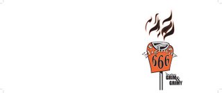
 And there it is, simple.
I had tried using a repeat pattern using dog illustrations and some other elements from the book but it was too complicated and it didn't really seem to suit the style of the project.
I'll do a test print of this to make sure it works.
The insert cards will be printed on a 12pt C2S (thats a 12 point coated 2 sides card stock) and trimmed to 5x7".
The way this would be abreviated when speccing a job like this would be 5"x7" (size) 4/4 (color, in this case CMYK) on a 12pt C2S. Easy eh?
5"x7"4/4 12pt C2S. The inverted comas (") are used to spec either feet or inches but for most work its assumed that inches are implied.
Thursday, September 07, 2006
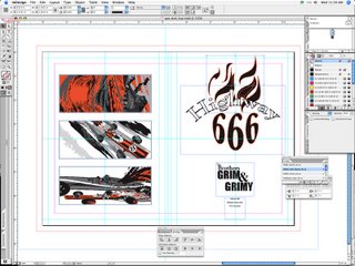
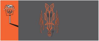
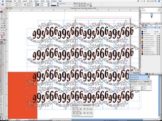 I started laying out a repeat pattern using the highway logo for the dvd insert. The front of the insert uses a standard 'Brothers Grim & Grimy' front with the logo and portrait on the accent color field.
I started here by arranging 2 logos top to bottom and then grouping, copying and pasting to build up the pattern.
 Got to share this with you, its a site thats dedicated to the Advertising art of Dr. Suess and theres some top notch stuff in here.
I particularly like the NBC adds and also these ones for bearings of all things for New Departure.
Magic.
I'm going to quote this from the sites introduction to give a little background on where this treasure trove came from and its place in Dr. Suess history.
'The Dr. Seuss Collection, housed at the Mandeville Special Collections Library at the University of California, San Diego, contains many examples of Dr. Seuss's advertising artwork. The library has scanned a selection of these advertisements for greater access. Besides promoting the Standard Oil companies Flit and Esso, Dr. Seuss's creations have hawked such diverse goods as ball bearings, radio promotional spots, beer, and sugar.'
Wednesday, September 06, 2006


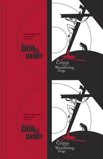
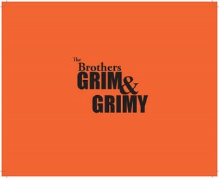
 So these are the exported pdf's of the 3 dvd sleeves. Each is different but the style is the same. You can see that I added the small dog illustration to the front of the red sleeve to make it stand out a little more, it just seemed plain with out it.
I took these screens by opening the documents in Acrobat and pressing Command L, which gives you a full screen preview without menu's and other crap in the way.
Just press ESC to jump back into program mode or Command W to close the file.
I have to go out and get some paying work done so I'll finish the dvd file tomorrow. I just need to do the interior cards which againg I'll pull out an existing template for.
Why go to all this bother? Two reasons really. The first is that I can use this same art to backup all the files for each project in a way thats easy to identify (a must when you have to deal with hundreds of files every year) and two becuase the first bite is with the eye and care should always be taken in how something is presented.
 Using the same template I throw down a cover for the dog's dvd that I can print at the same time. Although each dvd is based on the same template they will all have a little something different.
I mostly like this, but it seems a little plain so I'm going to add a dog illustration to make the front cover more interesting.
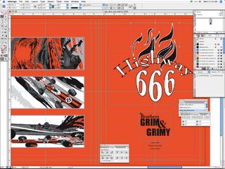 With the background color in place I have to change some of the elements.
Theres no point in having an red stroke sitting on top of an identical red background so I just open the linked files in Illustrator and change the stroke from red to black to make it stand out. I'll save this off as a new Illustrator file and then place it instead of the existing one in Indesign.
Time to save and export a pdf.
 I've started to lay out the dvd sleeve using an existing template.
The style and measurements are good, so its just the elements that I want to change. On the Indesign document you can see my safety, trim and bleed as well as previously placed artwork from the ape cd in the process of being resized and replaced.
 And heres the final artwork ready to print.
I left the template in place to show you how this works, naturally if this was a print ready file (I exported one of those as well) the template would be removed so that hairlines didn't appear on the stickers once it was removed from its backing and applied to the dvd's.
Time to move on to the case sleeves and inserts which again I'll pull from templates already created.
I work as a print technician and graphics operator, its sad but 90% of what I do is the same stuff again and again. The artwork changes, so do the materials requested but I have a bunch of templates that are used and re-used. Thats the nature of the beast. New wine, old bottles. To a certain extent its about established guides and formulas for safety's and bleeds etc. Theres also the non printed media to think about as well. If we're doing artwork for a dvd or cd, well a cd is round, the boxes only come in certain sizes etc. Technically an invite could be any shape and size you please but envelopes only come in certain sizes so there'd be no point in creating or printing cards that fit in no known envelope. The same goes for movie posters, tickets and damn near everthing that we produce. Certain formats are accepted and maintained because of cost and convention. Its the nature of the beast as it were.
Boring I know, but common sense really.
Now I'm laying in the other elements, including the pantone field on the left hand side to match the artwork. The template has been layed on top of everything so I can get the placement just so. I've resized the artwork to about 50% to make sure everything I want to see is inside the trim boundary, it is. Now all I have to do is work in the logo and change the copyright and file details on the left hand side before duplicating everything for the 2up template that I'm using.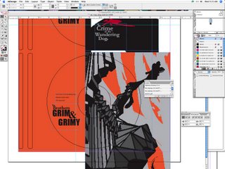

 Today I'm working on multiple projects mostly to do with box art for storage and submissions.
It consists of three elements. The dvd label, the insert card and the dvd sleeve art.
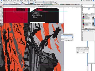
I use a template so that everything follows a certain conformity. The first step is opening a file from a previous project in Indesign and using that as the basis for the new design.
I've just started to lay in artwork having decided that the stairway image will work the best on the template that I like to use. You can see the artwork in the background is from 'The Crime of the Wandering Dog', my tale of apocalyptic fury that was the first Grim and Grimy outing.
I do a rough placing of the artwork on the template just for basic position. I like it, time to move on.
Tuesday, September 05, 2006
Okay, so thats it. Time to move on. Next project please.
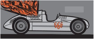
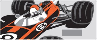
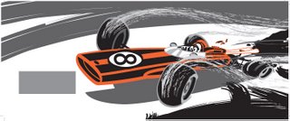
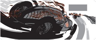
I'm sure that I'll end up editing some of the images at some point in the future when I get some feedback on them, but for now I'm done and ready to move on to something else.
For the most part I've fulfilled my brief and followed my rules, 2 colors, no transparencies and decoration inspired by and styled after hot rod pinstriping etc.
Its been incredible fun and I'm sure I'm going to draw more cars in the near future, I have an absolute ton of reference from the sixties and seventies to inspire me and I think I've developed a style that I can call my own. The one thing I didn't want to end up doing was thirty pages that looked exactly like a Von Dutch rip off and I'm happy to say that they don't.
Stick around while I flail about looking for the next big thing in my life, I have a few ideas but I'm entirely uncommited as to which way I might go.
Yours...
Subscribe to:
Comments (Atom)
