Friday, July 28, 2006


Just wanted to talk a little about method, how I work towards an illustration and all that jazz.

For me a book isn't really a collection of illustrations, there has to be a flow between the pages that make it work as a story. When I start out I try and do as many page flow sketches as I can. These are just tiny little sketches, one after another that try to lay out the entire book from start to finish. The first pass through will generally be disastarous, blank sections for pages you have no clue about, page spreads that just don't work, good ideas badly executed etc.

It doesn't matter, the point is to get something down. Especially for picture books where there has to be a flow, just like a film. If you could imagine a film that was shot with nothing but long shots, well, it would be unwatchable. The same goes for a picture book and finding a language, a tune to carry the story is the key to making it through. The reality is that when you start a project you might have an idea for one or two images that you want to use for key points in the story. Everything else, to a greater or lesser extent, is a battle.

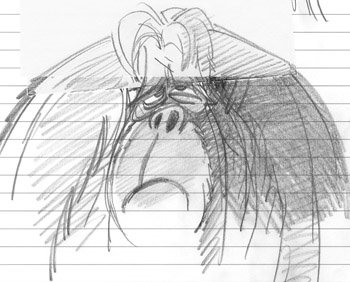
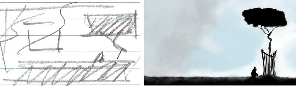
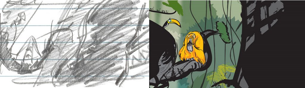
The three images above represent for me the three basic types of image that I have to deal with.

The top image was in my head from day one and in reality required little thought beyond how I might achieve it. I new the composition and the software I would use to do it, it was just a matter of getting it done. I don't even think I drew a finished sketch on it beyond the thumbnail, it was that easy.

The middle image was one that I fought with every inch of the way, I tried fifty different ideas before I found a way to tell the story. I changed the angle, the composition, the color, the gag. Everything that I wanted to do would not work as a page design. It was a fucking nightmare and I abandoned version after version before I combined an idea I had for the page that followed it and this one to get to the final version. I love this page because it was so hard. I cursed like a sailor to get it done but in the end I was very happy.

The final image is one where I thought I knew what I was doing. It was one of the first images in my head and in fact I found sketches of it that dated back to the late nineties. I actually had it storyboarded because I thought that I might like to animate it long before I ever finished even writing the rest of the book. But it was wrong and because it was wrong I couldn't get beyond a certain point with it. It was so wrong that I didn't even know it was wrong and I ended up drawing the same composition again and again thinking that it was right when it was wrong. This is the worst kind of image to get done because you're so sure of it that you can't even analyze why its wrong. 'How could it be wrong, I've wanted to do this for ages' you say to yourself. But its still wrong. In the end I threw out everything I had on it and just started again. The only rule was that I wasn't allowed to draw the same thing again. And what d'ya think happened? I found a way to get it done and in truth it wasn't so different from where I'd begun, but it was different enough to have frustrated me for six weeks.

So anyway, thats how art and design boil down for me. You have 3 types of image. The kind that you know how to do, the kind you don't know how to do and the last and worst sort, the kind you've fooled yourself into thinking you know how to do.

I love birds, but especially hummingbirds. I only ever saw my first one after moving to the states. I was just stunned by them, enchanted by how special they are. I always like to throw birds into my drawings when I can.

One of these days I'd like to do a book about one. My general method for coming up with a story is to take an animal (I don't really like drawing people) and place it in a situation that at first seems stuipid or ludicrious. If the story has merit then it kind of tells itself and I'm just left to make the pictures as charming as I can.

Now what am I going to do with those hummingbirds?
I just wanted to post this about an artist called Mel Crawford. I love his work, one of these days I want to design a whole book in a style like this.

Maybe this kind of work is mundane in the US but I never saw much work like this where I grew up.

Anyways, here are some links that show just a little of the huge body of work that this guy produced, theres hardly a bum image in the lot.

Wouldn't you know that JK would have boxes of this stuff lying around.

ASIFA had a huge amount of scans which can be found here (link)

And you might want to stop by the Inspiration Grab Bag and check out some of these images here (link)

Everything is so colorful and fun, its funking brill. This is a style that I think would lend itself well to modern software such as Photoshop and Illustrator.

Bra-fucking-vo.
This is another page spread that uses the same three colors as this one (link)

The point, other than the fact that this book is a much starker enteprise than my other work, was to try to double up the printing of certain pages together so I could break the production down onto multiple presses. This way I get to change paper stocks and finishes without paying for equipment that I wasn't using. Some groups of pages would go to a 2 color press, others onto a 4 color. If you can break your production down into elements that can be produced together then you can keep the cost way down.

Just to put it into perspective, to print the same 2 color page on a 2 color press versus a 4 color press might cost one third as much. This is money saved. Okay, so it takes more work and you have to stay on top of things but I don't know that many people who have so much money to burn that they can afford to throw 2 color work at a 5 color press.

Oh yeah, if you do or plan to do print work that will end up on a press get yourself a pantone swatch book, its invaluable. The colors that you see on screen are not always as they print and that can lead to problems and unhappy clients. Much better to know what to expect before you head to press. Save time, save money, double check everything.
I just pre-ordered this book and I'm really looking forward to getting it late next week. Theres a lot of material available from the earlier golden age of animation that stretched up to the end of the forties. Theres also a lot of material available for the modern history of animation that I guess started with Disney films of the late eighties and Roger Rabbit etc.

Theres a dearth of information available from the fifties UPA style and this is a book that really needed to be written. I hope I'm not investing too much hope in how good the book is going to be but I'm really looking forward to getting my copy.

You can visit the Cartoon Modern blog here (link)
or perhaps check out the post on BoingBoing about the book here (link)
or visit Amazon for a hefty discount here (link)

Thursday, July 27, 2006

This is a page spread that was set up using 2 colors, black and a call out. The grey is a 50% screen and the lighter blue is an 80% screen (pantone 298). The verses for the page are in the white area on the left hand side. This is an Illustrator piece from 'The Crime of the Wandering Dog', my upcoming self publish book. It's designed to be cheap to print because I'll be spending my own money on it and when you spend your own money you have to be very frugal to get the most bang for the buck. (buck = american peso)

Wednesday, July 26, 2006


And now for something completely different. This is a 3 color (2 spots and process black) page spread from another book. It was inspired by Bosche and other late middle age painters with their strange visions of hell. This book was meant to be much more pared back so most of it is one or two colors per page, black and a callout. I intended to self publish the book so the cost of the printing was a big consideration. Most small presses can run at least two colors and its cheaper to use a small press than a large one. Between pantone callouts and selective use of screens a certain look could be established that would be relatively cheap to achieve.

Oh yeah, fuck Quark. After Indesign came out I never loaded it again. If anyone has any doubts they should download a trial version of CS2, its the fucking biz.
This is the final ape image for a while, going to move onto dogs. This is the image that pound for pound probably took the longest out of all the images in the book. I originally tried to draw the boat but I'm not very good at drawing geometrical objects in perspective. Eventually I moved onto a simple 3D program and just built a little model which I rendered out and placed in the image before blending it in. I like the sense of whimsy. The colors worked out quite well too. Actually the color was settled long before I'd filled in all the detail which is kind of backwards for me, but sometimes you have to roll with the punches.

Half way through the piece I was forced to upgrade the memory on my computer to 3 gigs. I certainly stopped all the crashing that Creative Suite had a tendency to do with half that.

Oh yeah, damn near everything was done freehand other than the boat. I use a wacom tablet for stuff like this, its a godsend.
So this is how it all worked out. The composition wouldn't work with the ape entirely in frame so I flipped it and used the distort filter in illustrator to warp the ape's reflection slightly. The text goes on the large pale blue area on the left.

I didn't plan it like this, but sometimes you just have to change things to make them work.

I think the point is that you shouldn't get too hung up on a drawing or image trying to force it to work. When we were in college one of our intructors used to correct our animation drawings with a big fat red marker. He'd always tell us (as he slashed through your drawings) not to get precious with them. He had a point but he was still a bastard.
Rough sketch done for a page spread. Post-its are a slobs best friend. You get a good idea of how big the drawing is by the horizontal lines. I did a job for a customer that left me with about five hundred writing pads, so I put them in storage and use them for everything. Thats the best thing about cheap paper, use it, tear it up, throw it out if it doesn't work.

I sometimes get the idea that I should use drawing paper but it never works out. Its just too nice and I get too nervous so I can never do the sort of scrubby, messy drawings that seem to work out for me.

Some people never learn. All my best stuff is on paper you wouldn't wipe your ass with.
Heres a number of sketches for a page that didn't and wouldn't work no matter what I threw at it. The composition kind of fell to pieces when I threw it on the page spread. The ape perhaps ended up being too tall or too big, small, fat, thin etc.

I kind of hate this sort of situation. However, needs must when the devil pees in your kettle. I'll post the finished piece later so you can see how the page spread worked itself out.


I think that this one started out as an illustration piece, maybe that was the problem. I kind of got fixated on the expression and pose without considering what it was the page needed to work as a design.

PS I always tend to write myself notes on the artwork, its a habit I picked up becuase sometimes its easier to write something than it is to draw it. Pencil oneself a note and move on. It might be a throwback to my storyboard days. The way the business worked was with round after round of thumbnails and revisions, post-its and scribbled direction. I always thought that there was nothing uglier than a stack of storyboards a week before the final deadline. Thats life I suppose.

This is a page spread that just worked from the start. I wanted to place four verses of text, two on each wing and leave the monkey in the middle. I don't remember doing a second sketch for this one, so it went from here to Illustrator. This was the first page spread that I actually locked down and called finished. I'm still kind of happy with it, even though I rarely like my own artwork after a (short) time. Maybe the best kind of illustrations work because they commuinicate, which is not dependant on excellent art per se. The verses that the page was designed for was about protest and counter protest in a divided society with the ape as a pawn between. If you think that it works let me know.

Tuesday, July 25, 2006

This was a spread for an illustration that was really tough to work out. I put it off again and again hoping that I could buy myself more time. It was eventually the last page left to do and I had no choice but to do it.

That very day I saw a photo on boingboing by this dude thats always on PBS, I think he may host Nova and it showed the sun setting (or rising) directly east (or west) and shining straight down the streets of New York. Beautiful. My girl calls it serendipity and I don't disagree.

I love it when it all comes together like that. Very rough pencil sketch and then a lot of work in photoshop to make it glow.
Heres the finished piece. I wanted it to be as dark as it could possibly be and still be an illustration for a childrens book. This was the emotional low point of the story so the misery had to be apparent.

Don't forget people, color works at the speed of light.
Final rough sketch before the illustrator page was put together. I don't like to draw too clean, it kills it for me. This is as good as it gets for me with pencil and paper. Everything I draw is on cheap throw away pads.

I like to use good pencils and cheap paper, works out much better than cheap pencils on good paper.

Tombou 4B's are my favorite, I have a huge store of them. Started putting them by a few years back after getting caught out in the Great Pencil Famine of '97.
Drinking monkey roughs. Hehe, these were done in 2001 for a book I was thinking about. Next post will be the final page spread that came out of it.


Trying to customize blogger to change the layout, here goes try number 1.
Please ignore this post