
Saturday, August 05, 2006


 This is the direction I want to move with. I'm playing with the pinstriping for decoration. I'm torn between doing the pages with no pin stripes and then decorating afterwards (like how its done in the real world), or designing the pages from the start incorporating the striping in as the image goes down.
No doubt it will work itself out and end up being some combination of both. Anyway, this is just a little test to see if I like it.
 Three weeks and three days left to go.
Heres the first finished (for now) page spread. This is an rgb of a 2 color spot illustration. I tried to adjust the color to better match my chosen spot (Pantone Warm Red) but its kind of futile because everyones monitors are different etc. You'll just have to take my word for it, the color is great.
I need to start researching pinstriping. If theres anyone out there who'd like to try their hand at pinstriping some of the pages or has suggestions on technique or style I'd love to hear it. The idea at the end is to have the entire book pinstriped by incorporating it into the style of the illustrations.
Have to have a thinky about that.
This is a very graphic page, it didn't take long to do the final illustration, but by god it took ages to even come up with the idea in the first place. 90% contemplation 10% execution...
Friday, August 04, 2006


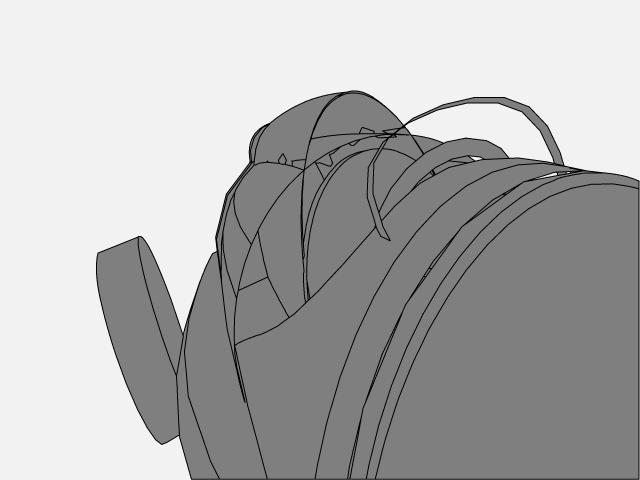
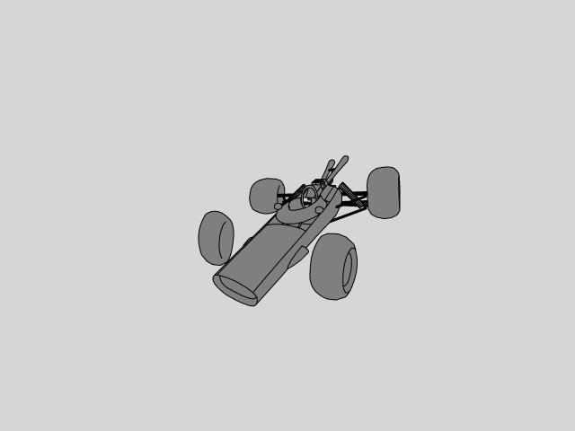
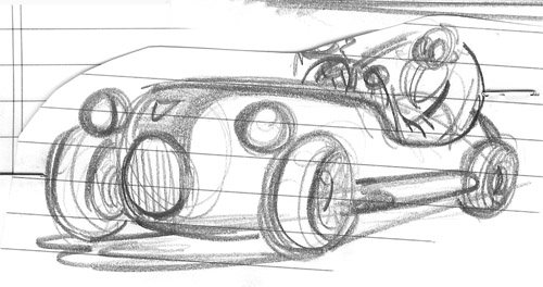
 So I did a quick model of the devils ride as well, again just to get the solidity I want in the volumns. No point reinventing the wheel.
The devils car is going to be about twice as massive as it would be in real life. I already have the verses layered into my Indesign document and I've started to play with pages to find a nice beat. If something isn't working in my compositions I do one of two things.
Thing 1: Move on, I have too much other stuff to do and the clock is ticking. Make a note and try to find a logical moment to do it later, as needed.
This usually means that you do it only when you absolutely need it.
Thing 2: Start to thumbnail again on the composition. The rule is that whatever you draw, no matter what the image contains, must be different from the composition that isn't working. I waste too much time looking at the same drawing that still won't work. So I developed this rule and it actually works. It all boils down to 'Try Something Different'.


 Three Weeks and Four Days Left
Its 2 oclock on a Friday, I just got in from work and started to crack out the first page.
The cars are for position and the color looks bad because its a jpeg of a spot color. Get used to it, things don't look like they should, but when it goes on press I know exactly what I'm going to get. I know because I picked it from a swatch. I said 'I want that one'. And thats the one I'm going to get. Its a warm red that looks like the flesh under the skin of a super fresh tomato. Dribble.
Its a yummy bright red like the best raw tuna. Slurp. Picture it in your mind. Delicious.
Thursday, August 03, 2006
Rule #2 states that the book needs to have limited color and this is where I made the decision on what color I'm going to use. I want to do 2 colors, with screens and I know I'm going to need black so I have one color to choose. I want a bright color to help punch up the page spreads so I went with Pantone Uncoated Warm Red. I always check my colors against a swatch because what you see on the screen with these callouts is not what comes back from print. Keep that in mind, check out what the color really looks like printed if you can before just picking on at random.
So my two colors will be Black and Pantone Warm Red. With the white of the page that makes three if we don't include screens and gradients.
A note about setting up Bleed
If you refer to THE WORLDS FASTEST PRINT LAYOUT LESSON then you can pretty much figure out how to do the next step. If the pagespread measures 20x8" then if we add a one quater inch bleed all round we get a final dimension of 20.5 x 8.5".
This is the most important measurement in the entire document. I set up a 54 page doecument in Indesign with a page dimesion of 8x10, specified Facing Pages, added my bleed setting and placed a 1 inch slug around the entire document.
All of my illustrations will be set up on a 20.5 x 8.5" document in Illustrator.
Oh yeah, thats Rule #5, no Photoshop, all illustrations are going to be done in Illustrator. This is a new one for me and I'm looking forward to the challenge.
Its time to start graphic designing. I need a title logo to set the mood.
 Three weeks and five days left.
And so it begins. I finished all the basic planning yesterday and now the heavy drawing begins. These are the proposed page spreads for the first two pages. The numbers on the left hand side are the verses that the page spreads need to accomadate. For some of the images I've referenced Dante (Divine Comedy:Inferno) and Milton (Paradise Lost) as well as some of my earlier work. The Lions Gate is the opening image and it was something that I had wanted to do for another project which was edited out.
I wrote a list of things I wanted to achieve with the book and they are as follows.
1: Really dark and really funny illustrations.
2: Limited color to make the book cheaper to produce
3: Limited detail, graphic look
4: Speed and danger, cool fucking cars...
I kind of suprised myself. When I started thumbnailing the page spreads I made it all the way through from start to finish on the first go. There are images in the sequence that didn't work but the point for me is to just make it through. Problem pages will need to be addressed as more detailed work is done. From there I try to expand the thumbnails to a size I can actually use, detail sketches are added to clarify details within the compositions.
Things are going too well, there must be troubled waters ahead.
Wednesday, August 02, 2006


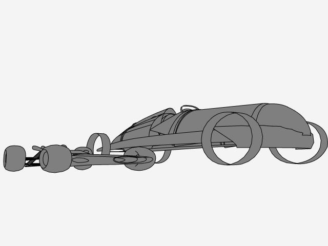
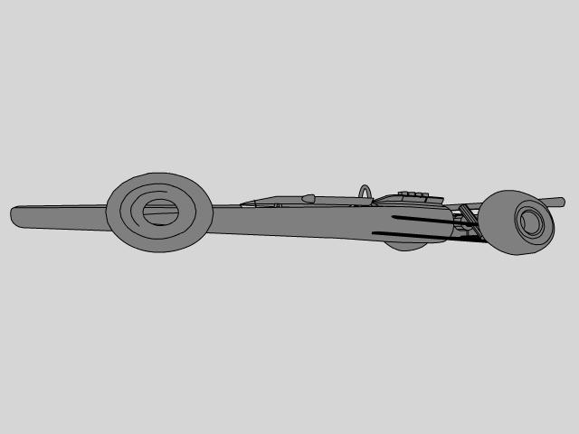
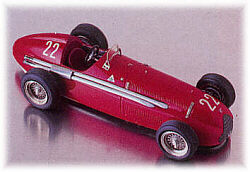
 I believe hugely in fate, or at least strange coincidence that leads me to certain things. I had wanted to use a Type C (Auto Union) as a model for the devils car because its meaner looking in than the Type D seen here, however, I found a model and a schematic for the Type D and I'm not going to argue with fate.
The model will provide some fairly fantastic lighting reference and the schematic I can use to build a fairly simple 3D model for posing the major geometries.
More later, time is forcing me to make lots of decisions quickly so that I might make my self imposed deadline (4weeks) with a couple days left over to polish.
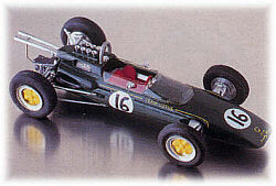
 Three weeks and six days or something like that
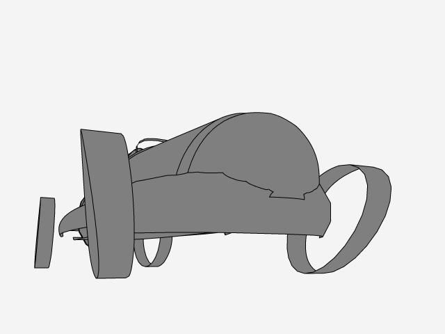
Alrighty then. I got a lot of work done last night after dark. I originally had the devil driving an alfa romeo tipo 159, but I'm starting to think that may not work. Its wrecking some compositions because the devil sits so far back over the rear axle.
Plan B, the devils ride needs to be rear engined so hes sitting up front. The scale differences will make it easier to compose with the new layout.
I love the pre-war Auto Union, so I'm going to use the 1936-37 type C which you can see details of here (link)
What a bueaty huh?
Famous car, great design, looks down right evil. Its got satan written all over it.
Tuesday, August 01, 2006
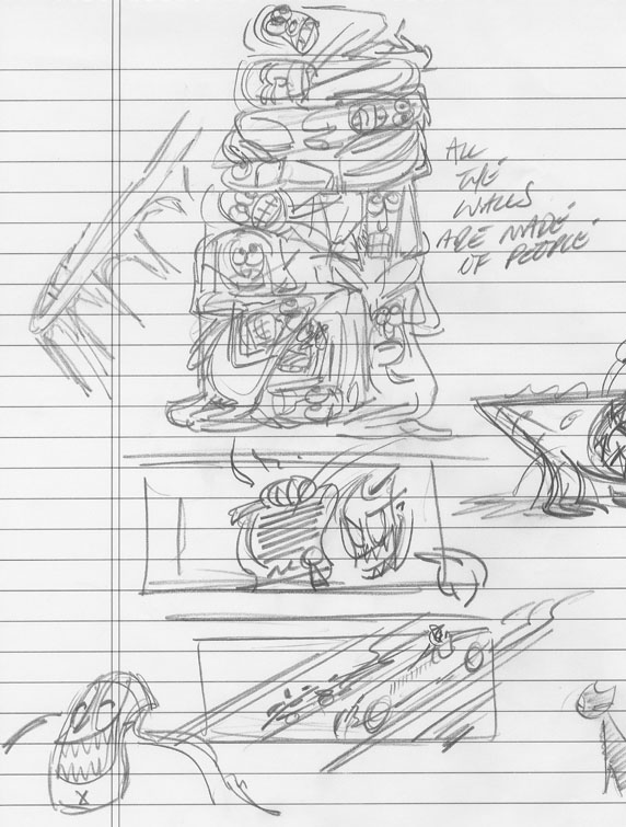 These are the first designs and layout ideas starting to come together. The pillars made of people is something I got from reading Dante. The devil himself is an old design that was used for 'The Crime of the Wandering Dog' illustrations. The sequence ended up being cut back and I had all these designs I really wanted to use and nothing to do with them. So I had to come up with a story where I could use them.
Consider it 'scraps for dinner' kind of art. It has three of my favorite things. Hats, formula 1 cars and hell.
 Four weeks left to try to get this done. I love impossible deadlines.
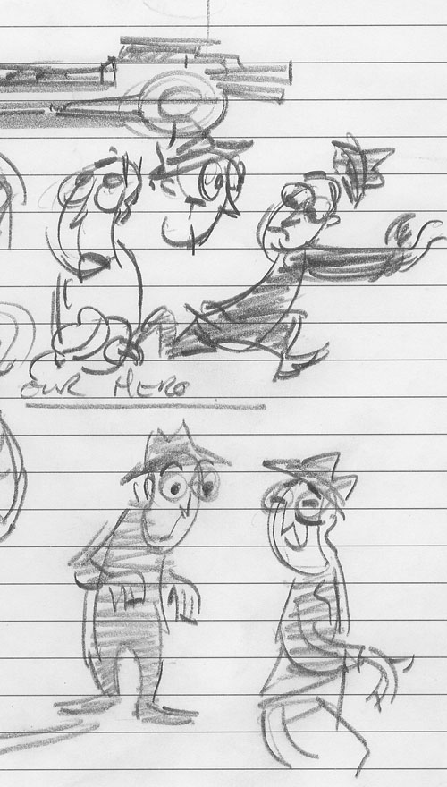
So the process begins. These are some of the first sketches where the protagonist is actually starting to work for me. Of course this stuff will be refined, but for now this is enough to start sketching with.
When I worked as a storyboard (piss) artist I got so disheveled as an artist that I couldn't draw a board until I had a design in front of me. I'd been so beaten down by the non-sensical process of production television animation that I wouldn't start a board until I had a design actually in my hand.
That might sound crazy, but if I went ahead and just started to draw, designing the stuff I'd need to tell the story, them fuckers would design something entirely opposite to what I'd just drawn. It would kill my board and I'd have to pretty much start from scratch anyway.
Anyway, back to out protagonist. This I like, the hat amuses me and I can start to bash out sketches for all the other things I need too. I do like to re-use designs and ideas from my other work, it helps to tie together my projects so theres a wholeness and connectedness to it (as much as possible anyway).
Monday, July 31, 2006
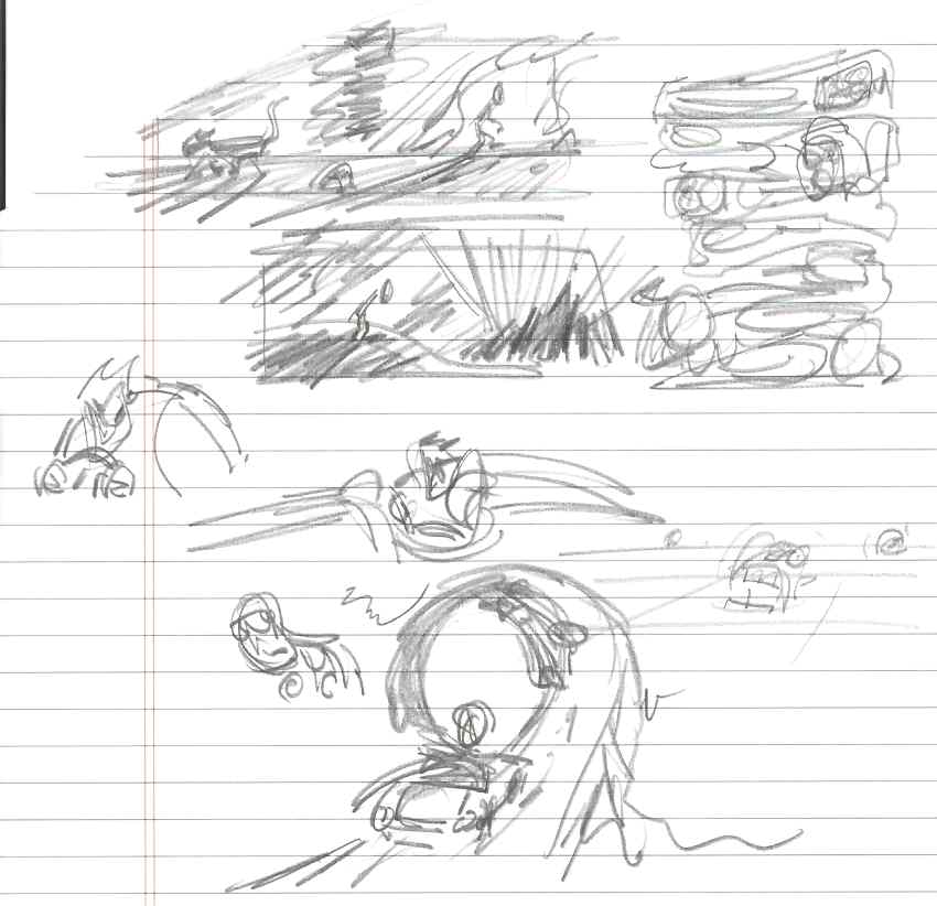 So the actual sketching process begins with pages like this. Hundreds of pages like this. The best will be scanned and manipulated to come up with the page layouts. I'm thinking about 15 - 20 pages for the entire thing.
I'll fill notebooks with these little drawings and gradually start to push towards some finished pages. Nothing is set yet, everything is fluid.
 WORLDS FASTEST PRINT LAYOUT LESSON
This is everything you need to know to get started laying stuff out for PRINT
BLUE LINE: This is your SAFETY LINE within the printed page. It is an asthethic, not a technical call. It just represents the area that is 'safe' to layout your design in. It can be anywhere within the bounderies of the page.
BLACK LINE: This is your TRIM LINE and represents where the finished page will be cut. Anything that is placed outside this line will not finish up in the trimmed print. Think of it as the edge of the page in a book. By cutting stacks of different pages and binding them, one ends up with a book.
RED LINE: This is your BLEED LINE. It is the most important FOR ILLUSTRATORS. This is where you lay out your artwork to if it includes images that run up to the edge of the page. Its here so you can have images all the way past the trimmed edge of the page (see above). I'll talk more about this later, but for now thats all you need to know.
GREEN LINE: This is just the SLUG LINE, the extra area on the layout to give you room for markings and direction. Registration and crop marks go here. Anything that needs to be printed on a sheet that is not considered part of the 'to be printed design' goes out beyond the bleed line in the slug. Easy right. Like the safety line its anyones call to make. Some people like a large slug, some like it small. As long (and it has to be) as the slug is larger than the layout itself then you're good.
And theres the lesson. Thats all there is. If you know these four facts you can at least competently lay out a simple design that any professional printer or print designer will at least be able to understand.

A WORD ABOUT PAGE DIMENSION
Above and beyond the basic idea the thing I first decide is format, what size the book will be. My first book was 6.25x10.5. Thats the dimension of a single trimmed page. My next project was a more square 9x10.5.
This one I would like to do a much wider format, almost like a pananvision kind of ratio so I'm going to start with a rough dimension of 10x8.5 (horizontal dimension first, vertical second) to give me a lot of page to work with. This is just a rough idea and its no big deal to change later if the format doesn't work when I start producing artwork.
Using this basic idea I'll start to sketch in this over wide format and see how that goes, I have only a couple of ideas for page spreads but its enough to get on with for now.
I'll post some of the first sketches up later when Blogger gets it shit together, it seems to be choking right now.
Sunday, July 30, 2006
 I'm just about to start a new project based on a very old story indeed. Its kind of killing time for me while I start researching my next long format piece. I'm hoping to include this thought exercise in a book of short stories with the intention of having the entire thing done in about a year or so (no hurry as it were).
Anyway, I'll be posting about how and why I do certain things when the target is to have the book printed in the future. The process for print is somewhat different than it is for most everything else though theres a lot of crossover in some respects.
Anyways, just a heads up, its about a competition between the protagonist and the devil and like I said, its a very old story indeed. It also gives me a chance to draw cars, which I like to do so its a little bit self gratifying, bear with me if you can. Because I don't see a commercial interest in this piece and also because its only supposed to be one piece of a collection I don't intend to hurry, but I'll post irregularly between my other work to show you how and why I do certain things certain ways for print and how that corresponds to other media like animation design, storyboard and illustration. I might even explain a term or two.
Subscribe to:
Comments (Atom)
