Tuesday, August 22, 2006

This is a 2 color piece for the cover of my last project. Did it yesterday, just got a bunch of notes and corrections from my brother.

The colors are black (obviously) and Pantone 143C

Now back to work on Highway666...
I started building brushes in Illustrator to start at least playing with pinstriping. I made calligraphic brushes with variations based on heading to give it that 'sword brush' kind of look.

I'll post some stuff later when I can get blogger to upload.
Seven days left

I tried to upload to blogger this morning but no joy.

Last night I started to scribble on my large scale prints, marking out corrections, playing with the pinstriping and drawing in details. Too much work to even think about, I'll need to start making lists which I'll gradually scratch out as the pages are completed.

More later...

Monday, August 21, 2006


Eight days left.

I prepared a medium resolution pdf for the the book that I'm going to print this morning. I'll start scribbling on the print and making lists of all the fixes/clean-ups and sketches required to finish the book on time.

I'm looking forward to seeing it printed all big, it makes a huge difference to have something that size to work with. More about that later.

This is a page of scans for the last spread in the book, I'll work on this later too.

I'm still trying to figure out if I should use a checker flag or just a white line or maybe a finish post to represent the end. I'm sure it's going to work itself out.

Sunday, August 20, 2006


I just found this over at Cartoon Modern and its so good I had to share. They're stills from a 1958 Italian Petrol Association TV commercial.

I just set it as my new desktop, I'm really loving it.

Click through for a sizeable jpeg...


Nine days left.

Its a Sunday, not much going on. I started to look at the entire document today and then just go through each page and tweak or add just enough to move everything forward.

Still trying to design Bedlam, still got to do a couple more car drawings, still got to do a lot of clean-up and I still have a lot of charactar stuff to draw.

Still, I have to say that its mostly looking good and its almost ready for its first near full size print. I have access to a 50k Xerox with a Fiery front end which makes running tests very easy. The Fiery handles spot color matching and its pdf integration means that its very easy to compile and tranfer files. Once the large prints are done then I'll draw over then with black red and silver markers (one for each print color and silver to simulate white for the underlying paper) and start to finalize some images.

Thats for tomorrow, today I just posed the Lotus25 for the last time (I think).

The difference between the two renders is kind of subtle, but one was taken from an orthographic camera and deformed with a lattice while the other was taken from a perspective veiw and has no deformations applied. The idea behind them both is the same, to try to create something that is more graphic for the final page, not sure exactly which direction it might go yet.

More on that tomorrow.

Saturday, August 19, 2006

I posted these WIPs of the Bedlam spread. Theres still a lot of work to do on it, mostly the city itself, but not today.

The cat needs to be resized and moved to the right somewhat. Maybe I can find a place for her somewhere in the bottom left corner, I don't know yet.

I'm working on the city itself further down on the artboard. I'll post a view of the entire artboard when the page is finished.

More tomorrow...


This is a number of sketches that I hope will let me finish the Bedlam page. I've already made and posted the model for the city in the center. That makes it a bit easier to follow through and draw the rest in.

The only thing I don't have a clue about in here is the cat. I have no drawings that I'm happy with. It'll work itself out, maybe not today, but eventually I'll find a shape I can live with.
Ten days left.

More later, I'm building a little model to help me get the Dis (Bedlam) page done.

More later...

Friday, August 18, 2006

I've had to start to think about the geography of hell. Its been imagined thousands of times, but for my purposes I like the spiral structure. Dante talked about layers, like an upturned cake. Milton favored the immeasurable pit. My Hell, once the Lion's Gate is passed, is followed by the spiral stairway that snakes down into the abyss. After that the dark plain stretches out until the road down is reached in the very center.

As the road down is followed it gets darker and hotter, the demons meaner, the sins worse. At very bottom is the city of Bedlam, or Dis. Thats where we're going now.

These are some sketches for this part of the book. The city looks kind of like a cake in these drawings. The "OPEN 24HOURS" may stay.
I just had a revelation for the piece I'm working on. I suddenly realized that it was wrong. I'm not entirely sure what I can do to fix it yet, but that'll come. The problem is that at least a third of the page was just bare, even accounting for the pinstriping to come later, it was just too bare.

I'm just sketching some fixes for it now. The golden rule when trying to redesign something is 'draw anything except whats already drawn'. As long as I sketch away from the direction I know is wrong my chances of finding a better way are very much improved.
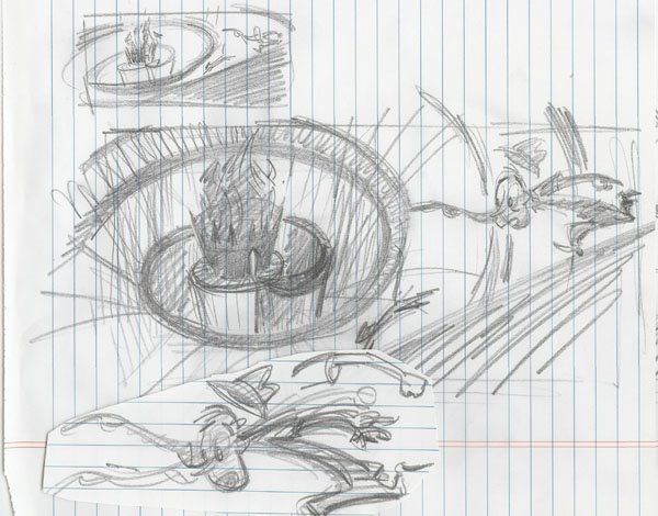
This is a sketch for the last page that hasn't in any way been tackled yet. The image has always looked pretty much like this but I've flipped the composition to break up the direction of the pages.

I think it might tie into the spiral stairway image, which I love, that curls back and forth. By breaking the direction up it gets a little more twisted and turned in on itself.

When I worked as a storyboard artist I was always prevented from playing with peoples heads like this. I was trying to make people feel uncomfortable in places, cutting a little too close, showing not quite enough to make a picture, that sort of thing. I did a fight sequence in a Duckman cartoon where I'd inserted no narrative. It was just random acts of violence cut together. It was just about 30 seconds of 'too close for comfort' groin stomps, a shot of fingers and a foot coming down hard, cut to a face pain distorted face etc.

Needless to say, I loved it. The producers were not so happy it seems. My director at the time, a guy called Stever Loter, faught for every last shot (or at least told me he did) and we did manage to keep a few at least.

I wasn't too upset, I knew it would be a long shot for this sort of boarding to go through the process uncut. The truth is that after those timing jackals had done their dirty deeds I could barely recognize my own work when it was played back to me, so its not like my intent was ever likely to survive intact anyway.

Okay, on the previous post I layed out a page spread from start to finish. The sketch was quite loose but I had done a lot of sketching for this page. The Lion's Gate motif is something I've used before. Its a very graphic symbol, and its suprisingly common. A quick google reveals Lion's Gates in cities all around the world.

The image here shows my entire artboard with all the sketches and scans that went into the piece. Thats kind of how I work, I improvise a lot, just doing what I think feels right. Theres a lot of pick and mixing, a stroke from this image, a shape from that one.

The sign is a Dante reference, although depending on the translation the real incantation reads 'THROUGH ME THE WAY INTO THE SUFFERING CITY, THROUGH ME THE WAY TO THE ETERNAL PAIN, THROUGH ME THE WAY THAT RUNS AMONG THE LOST. JUSTICE URGED ON MY HIGH ARTIFICER; MY MAKER WAS DIVINE AUTHORITY, THE HIGHEST WISDOM, AND THE PRIMAL LOVE. BEFORE ME NOTHING BUT ETERNAL THINGS WERE MADE, AND I ENDURE ETERNALLY. ABANDON EVERY HOPE WHO ENTER' and lacks the often repeated 'HERE'. Oh yeah, and its inscribed above the door and not on a sign as such. Artistic license, you can't beat it.


I've been sketching the hero for nearly 3 weeks now and this is the direction he seems to be heading in. He seems to me to be some kind of a hipster doofus. Thats okay for the start of the story, but when the cars show up he starts to channel Jim Clark (RIP).

The hat is a joke. I took to wearing one when the temperature got over 115F here in too sunny Los Angeles. It suddenly made sense to keep your bonce out of the sun.

Comfy too.
Eleven days left. I went with a change of direction for this page because it just wouldn't work any other way. The pinstriping is temporary, just a placeholder while I have a think about it.

I did a lot of sketching last night and I think I got some good stuff. Looking forward to trying to translate it into some finished work. I'm working on 3 pages at once now, trying to force a direction for one, still sketching compositions for the second and noodling the third. By my count I have 4 pages where theres not so much as a line down yet. Thats making me nervous. If I could just figure out a way forward on a couple of them it would take some of the pressure off. I'm hoping I'll get to work all day on the book, it looks like its going to be a slow day otherwise with my usual clients out of town for a long weekend. I'll post some of the sketch work up later after its scanned.

Thursday, August 17, 2006


Things have slowed down to a crawl.

The idea now is to just start to push the images that are somewhat done forward, hopefully to a finish and at the same time produce one page spread a day. That would leave me with about 4 days for polishing and pinstriping.

Its possible, just not likely.

I did manage to get the bulk of this stairway page done yesterday, and sketched the figure last night. Lots of room for pinstriping on this one.