Thursday, August 17, 2006

Many revelations in the last twenty four hours. With twelve (I think) days to go I'm desperatly trying to fill the deficencies in my designs to find a style for the pages that aren't done yet.

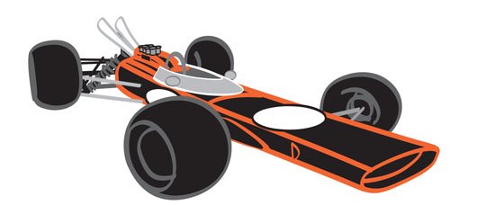
I thought that I'd shot myself in the foot because the cars were so solid that my drawings look two dimensional next to them. I think I found a way around. Its the simple approach really, just draw the charactars better. Bugger. Easier said than done. I've had to scrap a couple of pages but thats life. I spent last night sketching (and watching Project Runway) and I came up with a more sculptural sensibility for the figures. Lets see if it works.

How do you use the spelling checker in Blogger?

Wednesday, August 16, 2006

Found this great pinstriping video below on YouTube. Its made me more excited than ever to finish the main illustrations and then move onto the 'decoration phase'.

Isn't the Internets wonderful...
Working on the last few car poses. I think I have 3 page spreads left to do, 4 at the outside. Too much to do, less than two weeks to do it.
Anyway I changed the angle from the original sketch to give myself some negative space for the verse. If it doesn't work out I can always cut closer to fix the composition if thats whats called for. I think I'll probably have to cut closer than this for the finished page.
Thirteen days left, I'm shitting worms at this point. I have most of the middle of the book done to at least a certain degree. But that leaves a small block at the end of the book and a larger block at the start untouched.

Whats worse is that I have at least 4 other (hard) deadlines in the next two days that I can't miss.

A hard deadline, btw, are the deadlines that I cannot slip because a client is expecting and we're not at home to Mr. Fuckup.

Tuesday, August 15, 2006

This is a page spread that I did after buying a copy of MotorSport magazine. It was the May issue with the Cooper on the cover. Great pictures, but there was a shot from just inside the cover that may or may not have been taken by Malcolm Griffiths.

This one was kind of difficult, it seemed kind of plain when it was on the artboard. It just seemed to hang right when it was placed in Indesign with its corresponding verse. Can't explain why that happens sometimes. I eyes play tricks and the minds goes along for the ride.

Anyway, the photo was of a Cooper from a little later than my Lotus 25 (1963) but it was such a good photo that I had to do something with it.
The steps in the below process from bottom to top are as follows

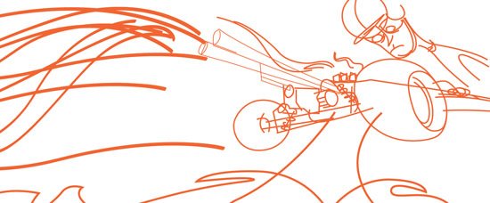
Step 1: After posing the model I start to trace in a bright color (easier to see)

Step2: After the tracing is done I'll stroke all the lines with a thicker line to make it stand out.

Step3: Without worrying about line thickness or detail I'll start to pick colors for the largest parts of the drawing.

Step4: Start to add detail and group lines and shapes together to make it easier to tame the image.

Step 5: Add lines that I'll use to define the movement in the piece. Because I want this illustration to seem like it was moving I used long sweeping lines that curled around the car.

The smoke was added to give the impression of a change of direction.

The composition was changed to allow more white space around the car.

Note, this is not finished. Thats all I'll do for now. Theres a lot of detail stuff that I'll pick up later after I've had a few days to look at it. All the little stuff I push back to the clean-up stage at the end of my deadline. For now this is a good start.


I'm going to go through the entire process of one page spread in the next couple of posts. It might take a day or two because theres a lot of steps, but here goes.

I had a picture in a book of a guy called Peter Arundell drifting the Lotus 25 R4 around a long sweeper and I liked it a lot.

I did some sketches, scanned here for your pleasure, trying to capture the feeling of the car at speed. I kind of liked the front angle of the car so I posed my model based on the photo and my sketch.

I try to always sketch inside a box thats roughly the same proportions as the pages I'm trying to lay out. The next post will have a few WIP shots as the image came together. Theres still a lot of polishing to do, but that will happen at a later date.

Two weeks even left. Fourteen days, shit.

I'd like to say that yesterday was great and I got lots done. I can't say that. As the work is pushed forward there are pages that increasingly become more resistant. Maybe they're not the right pages, that I don't know yet. I've always found the pages that are hardest to draw are the ones that should never have been there in the first place. This is as far as I got yesterday with this piece before I left it in frustration.

Monday, August 14, 2006


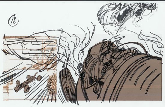
This is another worksheet that I've been working on. Again, its basically a 'where I'm at' with this particular image. Since I haven't made much traction with it in the last few I have to consider this one in Limbo for the moment. The detail at the top is for the devils pose. Still need to work out a few things before I can even attempt this one.

However, I like the composition so far, and I think, if I find a direction, that it will be a very nice page. I'll post some WIP's as it goes on.

Feeling hugely unmotivated today for some reason. Everything is hard today.
Two weeks one day left.

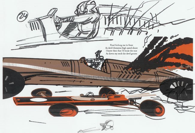
I've scanned one of my worksheets here to show you how this works. About once a day I'll generate a pdf of the entire book in spreads and print it out. The prints are then drawn over with anything that I think may be needed to finished the job. Digital illustration uses a lot of paper you see. Tombou 4B's and Sharpies are used for the worksheet process.

The kind of things that end up on the worksheets include notes on layering, character posing, special effects, repositioning type etc. It helps me to push towards the end and its good to get away from the computer every once in a while. Also because these sheets are half the size of the finished book (about 10" across) they're a lot easier to manage and keep track of than large sized prints that I'll use later for final finishing.

I'm not suggesting that this should be the way anyone else would do it, thats just the way I do it. After working for years as a designer and storyboard artist I can't really ever get away from the paper, I like the feel of it.

Sunday, August 13, 2006

When a composition isn't working out (see below) I usually start with a new file and group the major elements together before moving them over in three or four large clusters. I can move these around independently and find a more pleasing position without being distracted by the stuff I already know doesn't work.

Its getting late on Sunday and I don't want to work tonight. Maybe just a little light sketching and a spot of TV.

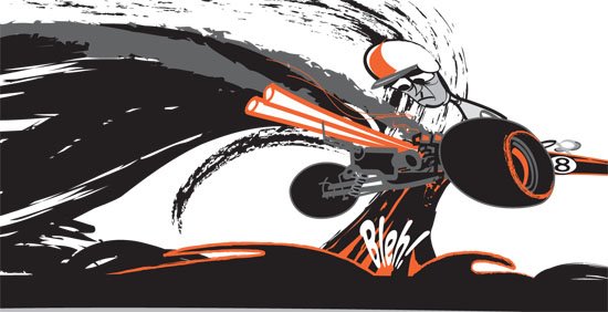
This one is not so far from finished now, just a little more detail on the rear suspension and engine/transmission as well as some engine parts shooting out the back, and some pinstriped flames, and a little more smoke, and maybe some splatter, and perhaps......
This is pretty much where I'm going to leave this for now. Its not finished, but theres enough down that I can move on.


So theres two weeks and two days left and its starting to look like a giant slog.

I'm working in something approaching a blur now to try to make up for Friday. This is a typical sketch at a fairly advanced stage. Just importing into Illustrator to start getting some lines down but the composition and major elements seem to be in the right place. I'll post some progress on this one later on, tomorrow morning at the latest.